Visual Identity, Naming
Ampek
Bringing power to life
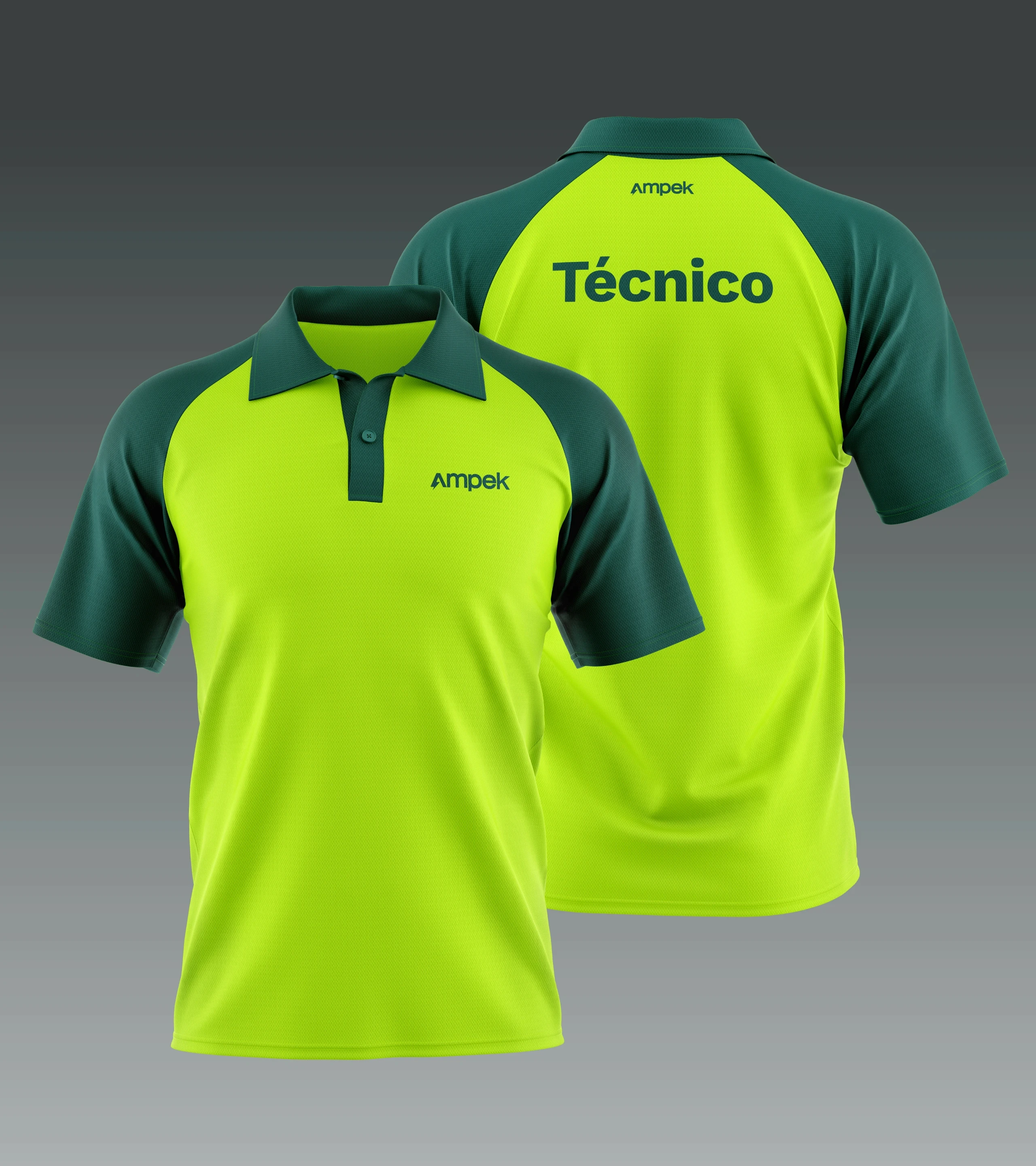
Ampek is a newly established electrical installations company that required a full brand identity from the ground up. Beyond just visuals, the project started with naming, where I combined “Ampere” (a fundamental unit of electric current) and “Impeccable” to create Ampek — a name that embodies precision, reliability, and excellence. The brand identity was developed to reflect the company’s commitment to efficiency, safety, and modern electrical solutions. The visual system is built around a bold yet clean aesthetic, using a dark green and neon yellow palette, symbolizing both trust and high-energy performance. From logo design to stationery, marketing materials, and digital presence, every element ensures a strong and cohesive brand identity. The result is a dynamic and professional brand that positions Ampek as a forward-thinking player in the electrical sector.
Client
Ampek
Area
Electrical Installations
YEar
2024
Country
Portugal


